When Marco first approached me with the idea of creating a progressive web app, naturally, I was both excited and intimidated. I was excited because I thought progressive web app sounded super cool and I imagined what it would feel like to create an app in which real users interact with something that we built. I was intimated by the simple fact that I would be learning Angular, which was another new computer language for me at the time.
After many talks with Marco about how the app could work and who it would be targeted towards, I was ready to start my journey of building my first progressive web app. This web app is an allergy diary that allows the user to track their reactions from day to day. Marco stressed how important it was to make the app extremely simple and accessible.
“Everything should be changeable with just a couple of touches or swipes of my thumb”
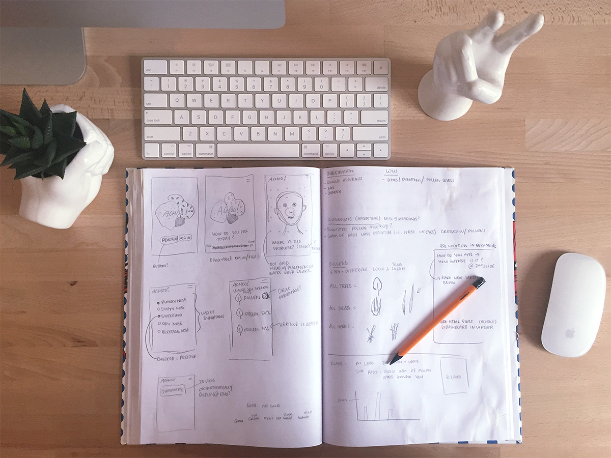
I began by creating a mood-board with a collection of colours, shapes, and clean, minimal fonts. From there I started to sketch out some wireframes and planned out each page in sequence.

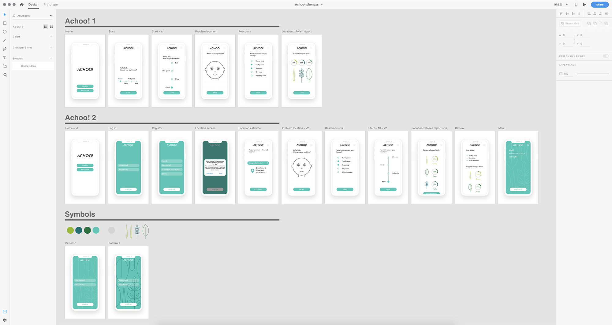
I then researched many common types of pollen allergies in order to develop any iconography that we would need for the app. After this first step, I was able to really visualize what the app could look like on my phone. But before diving right into any HTML I created an Adobe XD mock up.

Creating this mock up allowed me to play with colours, typography and the placement of elements. I found this step to be crucial to the development of this app because I was able to play around freely with different design ideas, and ultimately, I was able to create a strong cohesive brand.
See the next step in this article.